If your e-newsletter or e-shot are difficult to read, subscribers are more likely to delete it without reading.

An obvious statement perhaps but I am frequently amazed by the number of e-newsletters I receive which have illegible content.
Subscribers make their “open and read” decisions very quickly, particularly if reading on a smartphone. If subscribers have to strain their eyes or move closer to the screen to read your content many won’t bother. They will delete without reading.
My advice is simple. Make sure all elements of your e-newsletters are legible including areas such as terms and conditions and unsubscribe links.
This means making sure your font sizes are not too small. If in doubt make them a point or two larger. It also means ensuring your font colour is legible against your chosen background colour.
Here are some recent examples of newsletters I’ve received. Brand names have been obscured to spare blushes!
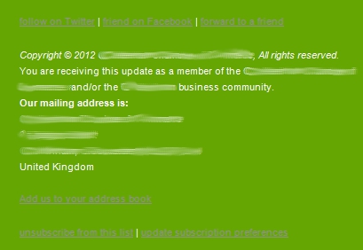
Example 1
Here various links such as unsubscribe and forward to a friend are illegible due to the grey text on a bright green background. The font is also very small which isn’t helping.

Example 2
In this example the text is far too small to be read easily. This text was in the main body of the newsletter. My eyesight is pretty good and I had to move closer to the screen to try and read it. Even then it was difficult.

Example 3 – major national retailer
The call to action here is aimed at people who have received a forwarded copy. The text is inviting them to subscribe. As you can see it’s almost impossible to read and this important message is buried in the small print at the end of the newsletter. This call to action, which is aimed at boosting subscribers, should be at the top and in legible font.

The other faux pas being committed is the “please do not reply to this email” message. I don’t agree with “do not reply” email addresses as I think you should make it easy for subscribers to get in touch.
In this example they’re asked to go to a Contact Us web page. The only problem is most people won’t see this message because it’s so small.
Example 2 is also written entirely in block capitals, which is more difficult to read than normal case